Streamline Data Analysis with
Auto Analysis
Timeline:
Jan 2022 - Mar 2022
sector:
Business Intelligence, Data Analytics, Natural Language, Artificial Intelligence
Team:
Design team: Avi Agarwaal, Dhruvi Betai, Sanjana Mohan
Product Management: Ganesh S, Aditya Vikram Godawat
Engineers: Prasad, Nehal
My role:
End-to-end project delivery, Product thinking and Solutioning, User Experience, Visual Design, Design for Web and Responsive, Facilitating and managing mobile design, Working closely with the tech team.
Introduction
Auto Analysis allows a user to analyze any data point in one click to understand why and what is contributing to its growth or decline. It saves hours of work for data analysts by performing an in-depth change, drivers, contribution & trend analysis in a single click. Each section and insight is explained using natural language for quick interpretation by everyone across the organization.
Problem
Analysts invest a lot of time trying to analyze a data point, tracking the trends, and getting to the crux of this number trying to find the factors influencing the growth or decline of the number. At Crux Intelligence, we often heard our clients voicing their frustrations with this particular problem. Boards and Ask were a great way to get numbers, but this number could also arise a lot of questions on how and why.
Process:
Defining the Principles
I learned that it’s great to base the foundation of any project on a set of principles that can be used as a guide and can be referred to time and again.
💡 Why I define principles before any project:
• Helps you focus on the goal that needs to be achieved
• Helps to establish the design goals and understand if other stakeholders are on board with this at an early stage of the project.
🔠 Simplicity
The output should not be intimidating to the users to consume.
👁 Overview
The feeling of having a complete overview of everything. A one stop solution.
🌎 Simulation
If Auto Analysis was in real world what would it be? How would it feel? How would it look?
🧠 Smart
How to demonstrate to users that the system provides decision-making insights, not just data.
✨ Magic
Last but not the least, magic. This whole experience has to be nothing but magical.
🍕 Fun Facts
The whole principle of having a magical experience made us read some case studies of Walt Disney and his philosophy of how he brings magic as a feeling into a users experience in everything. So within the team, our mantra was – “Magic” is Made by Optimizing the Mundane.
We also started metaphorically referring to each touch point that needs to be designed to how fairy god mother helps cinderella with her torn raggedy dress, to a beautiful ball gown.
Defining the Touch Points
Before starting to design, I listed down all the touch points that needs to be designed, for this feature.
The CTA (Animations, Icons and Placement)
Changes on the Explore Page
Loading Page
Notifications
Analysis Report
Before starting to design, I listed all the touch points that need to be designed, for this feature.
The CTA (Animations, Icons, and Placement)
Loading Page
Notifications
Analysis Report
Before starting to design, I listed all the touch points that need to be designed, for this feature.
The CTA (Animations, Icons, and Placement)
Loading Page
Notifications
Analysis Report
Designing a helpful and a powerful experience for the users – A Roller Coaster Ride
I was told by the team of product management that the backend might take up to 5 minutes to fetch the results due to how heavy the algorithm was and the user must be engaged and informed that it is an asynchronous process.
The kind of MVP that I intended ship looked like this:
www.cruxintelligence.com
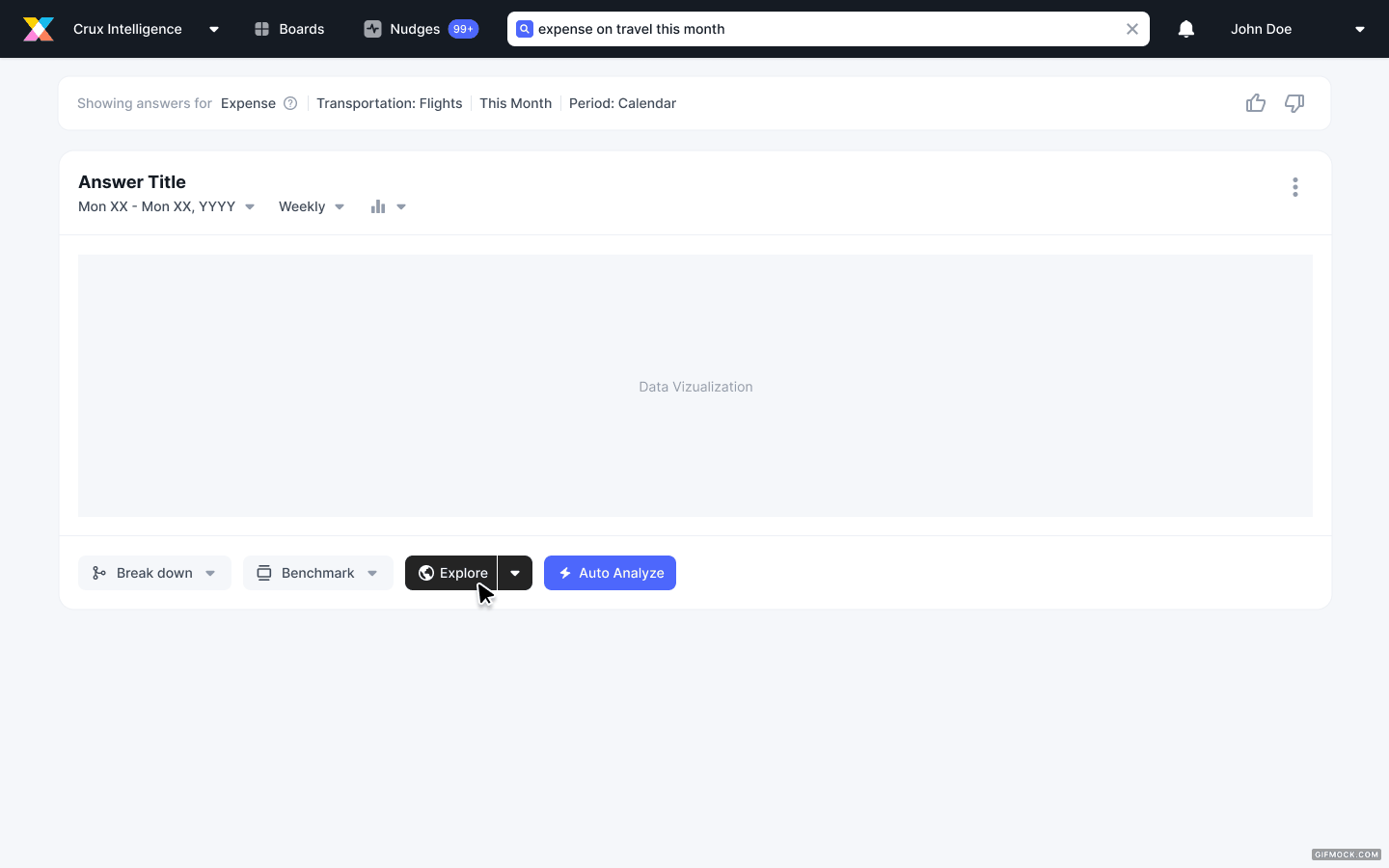
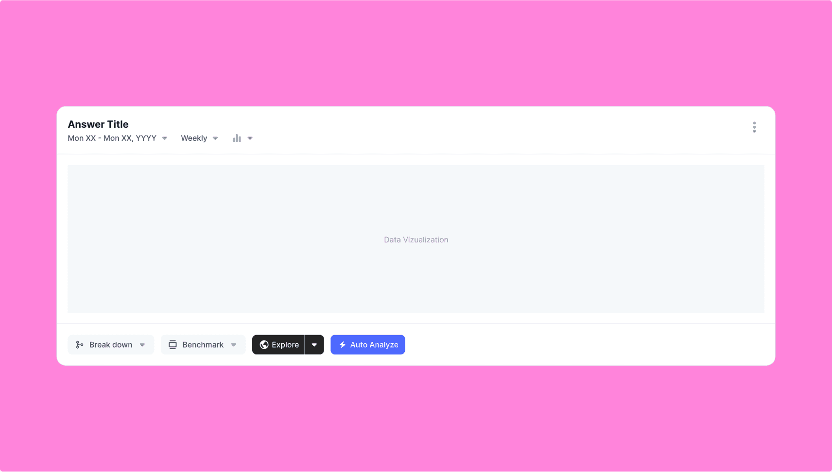
Designing the CTA
The button comprised of solving for the following things: The nomenclature (which was taken up by the Researcher, Ananya Rane), the icon and the hierarchy.
There were a lot of ideas for what the icon should be. Since the nomenclature was finalized to be Auto Analyze for the button, the explorations were on the lines of what the feature does, magic, and its “qualities”.
Finally the zap icon was chosen because the concept of magic came because of how the experience of this feature would be, and one of the most important facts of that experience was how this feature was cutting down hours worth of job of an analyst to just a few minutes. So it captures efficiency and speed.
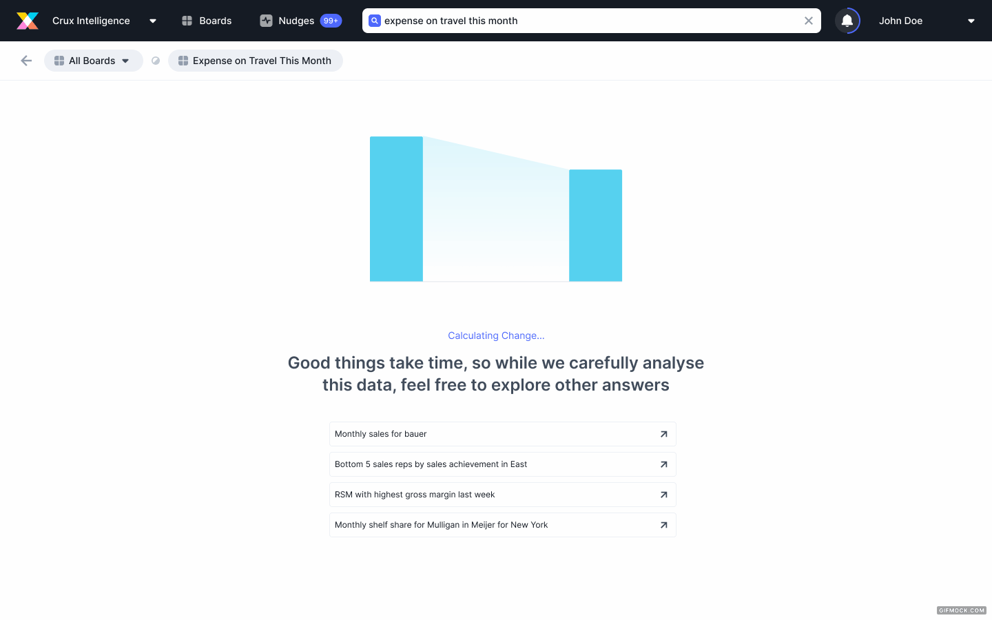
Designing the Loading Screen
The exploration for this was in two directions:
One:
Loading on the same screen as explore allows the user to see the results of explore while they wait.
Two:
Having a loading screen that communicates progress, gives prompts that can be explored further while they wait or even exit while the loading happens in the background.
www.cruxintelligence.com
✏️ Feedback
The major feedback given was that the backend team was planning to make the loading process happen asynchronously, and even though the second option would work, they found it hard to introduce for the MVP. Going with second option would also mean that we would have to solve it in the bread crumbs.
Designing the Notifications
Since the whole idea was for the loading to happen asynchronously, the idea was to introduce the concept of notifications which could later be expanded across the product. The notification icon, snack bar and dropdown would help the user navigate through the product easily while keeping track of the progress. It would work hand in hand with the second approach of loading screens.
www.cruxintelligence.com
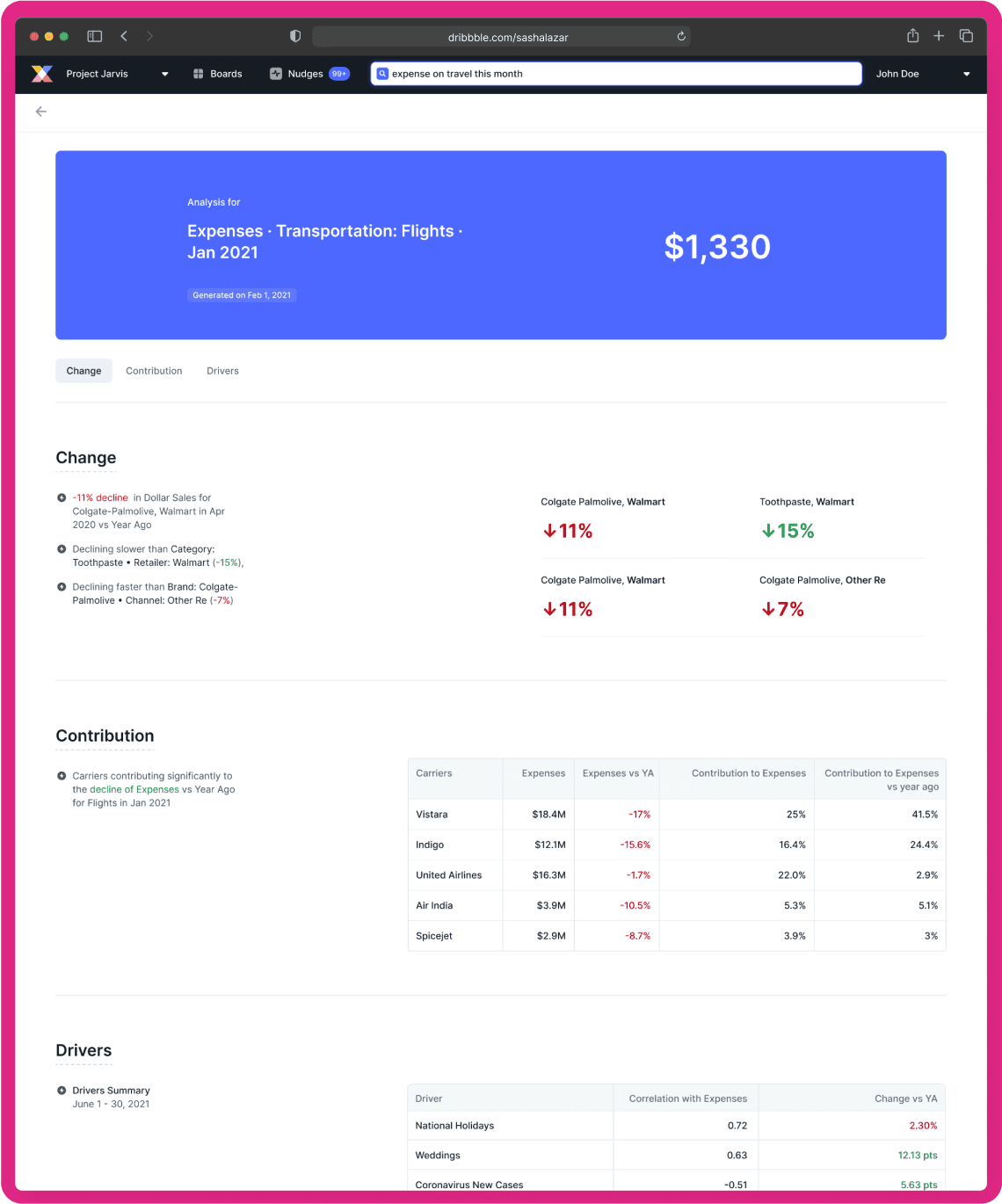
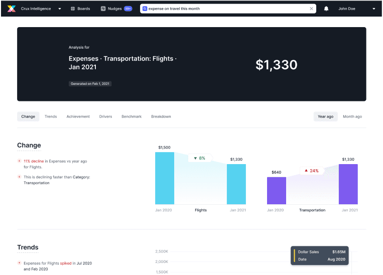
Designing the Analysis Report
When we applied our principle of simulation here, the final analysis screen would either be a dashboard/notice board or a report.
Explorations were done keeping both of these in mind. But soon it only made sense that the analysis would represent a report in the real word. Eventually we would want the user to be able to print this and download it. The dashboard route also went against the principle of simplicity. It felt more crowded and got harder to consume information without making it look intimidating or daunting.
A report style made it very simple to consume, the flow of consumption of data was very easy as there was clear hierarchy. It would also be easier to grow this concept and design further in future releases. It carried the current notions of design that was already established in the app and blended in effortlessly.
www.cruxintelligence.com
MVP Design
🚨 PLOT TWIST!
The MVP requirement was modified due to immediate client requirement and needed to have a lot lesser changes in the existing system. It had to be something the engineering and tech team could implement within the new proposed timeline.
Although most of these designs would be slowly pushed out as changes after the MVP, this was a new challenge at hand.
The MVP Designs
What was finally released –
www.cruxintelligence.com
www.cruxintelligence.com
Changes that were made:
The loading screens and notifications were completely ruled out and were in turn replaced by simple snack bars.
The users would be able to access all the analysis in a page of its own which would give the user all the information needed. This could be like a log of all the analysis that were triggered and their status.
The visuals of the “Change” data in the analysis report needed to be simplified.
Error states and components were designed for.
Components
The exploration for this was in two directions:
The List Cards
It's responsive
The title length can be set
Have read receipts
Status options
www.cruxintelligence.com
The Report Sections
Each of this was made into a component to ensure easy handoff to dev. It would also help the designer just add sections as needed and also play with the visuals and text without disturbing the other.
www.cruxintelligence.com
Web Responsive and Mobile Designs
As a part of the hand off, web responsive screens were also designed by me.
The mobile designs was done by Dhruvi Betai. The designs for this can be found on her portfolio.
My role in this was to facilitate her with design decisions since the project ownership was given to me. Basically was a moral support to her!
Metrics
Lorem ipsum dolor sit amet, consectetur adipiscing elit, sed do eiusmod tempor incididunt ut labore et dolore magna aliqua. Ut enim ad minim veniam, quis nostrud exercitation ullamco laboris nisi ut aliquip ex ea commodo consequat. Duis aute irure dolor in reprehenderit in voluptate velit esse cillum dolore eu fugiat nulla pariatur. Excepteur sint occaecat cupidatat non proident, sunt in culpa qui officia deserunt mollit anim id est laborum.
Starting point for any analysis for a business user
< 5 minutes on average to complete any analysis
Clean NLGs and outputs without complex terminologies that can be understood by business users.
Avg no. of times per user who clicked Auto Analyze > = 10 in the last 30 days - Cohort of users to be defined
Learnings
There are so many challenges that one faces throughout the project especially if you are repsponsible for it from start to finish. Treat these challenges as learnings, they just help you stay more true and realistic to the projects reality.
Set internal deadlines with yourself and the team. Dividing the work and setting goals for each sprint is helpful to hold yourself accountable.
Don’t let the reality take away your creativity. Its important to have that crazy exploration phase to make sure you explored all possibilities.
There are so many challenges that one faces throughout the project especially if you are responsible for it from start to finish. Treat these challenges as learnings, they just help you stay more true and realistic to the project's reality.
Set internal deadlines with yourself and the team. Dividing the work and setting goals for each sprint is helpful to hold yourself accountable.
Don’t let the reality take away your creativity. It's important to have that crazy exploration phase to make sure you explored all possibilities.