Achievement Widget:
In a Grid Layout
Timeline:
Apr 2022 - May 2022
sector:
Business Intelligence, Dashboard, Natural Language, Artificial Intelligence.
Team:
Design team: Avi Agarwaal, Sanjana Mohan
Product Management: Ganesh S, Aditya Vikram Godawat
Engineers: Prasad Bari, Nehal Gala
My role:
End-to-end project delivery, User Experience, Visual Design, and Working closely with the tech team.

Introduction
Boards is that section of the app that every user lands on as soon as they open the app. Each board is curated by the admin for a particular user group and they have some key widgets that they check first thing when they start to work every day. Although Crux is known for its Ask feature, the user gets to ask only after they consume numbers for the day and want to ask follow-up questions or analyze this number in detail to create reports.
Problem
The existing board section of the app, the widget which displays the achievement numbers and the KPI could visually use a treatment for easier consumption of information. All the widgets presented numbers similarly, so there was barely any hierarchy at first glance. Some of the other requirements were:
It would be great if the user could also see the actual and target achievement numbers.
Greater than 100% achievement was not an edge case and had to be solved.
Process:
Defining the Principles
I learned that it’s great to base the foundation of any project on a set of principles that can be used as a guide and can be referred to time and again.
✏️ Efficiency
Making consumption of numbers efficient at first glance.
👁 Clear Hierarchy
To establish clear hierarchy of information visually.
🌎 Clean and Simple Natural
Data visualization can often create clutter. The goal here is to maintain
🧠 Smart
The system provides suggestions that are the most relevant and eventually often asked by the user
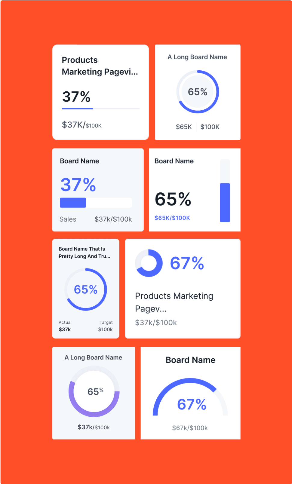
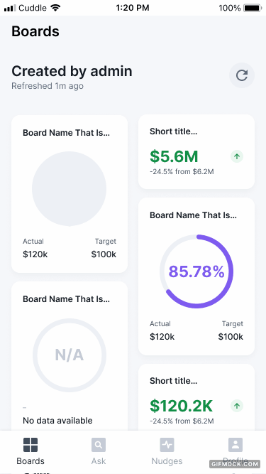
Widget explorations – Mobile
Below are some of the widget cards that were explored for a mobile layout. One of the main goal for this was to explore the different ways achievement number could be visually represented and also find layouts to represent the same set of data in unique ways.
Below are several widget card concepts for a mobile layout. The primary aim was to investigate various methods of visually presenting achievement numbers while discovering unique layouts for the same data set.
The exploration considered the following factors:
Neutral colors were essential as sentiments were not part of the development scope.
A mobile-first approach was adopted to ensure data compatibility between mobile and desktop layouts.
The central achievement percentage needed to be conspicuous and immediately noticeable.
The visual representation of the percentage should effortlessly complement the data.
'Actual' and 'target' were the preferred titles for the respective numbers.
The design accommodated the possibility of the widget title spanning two lines.
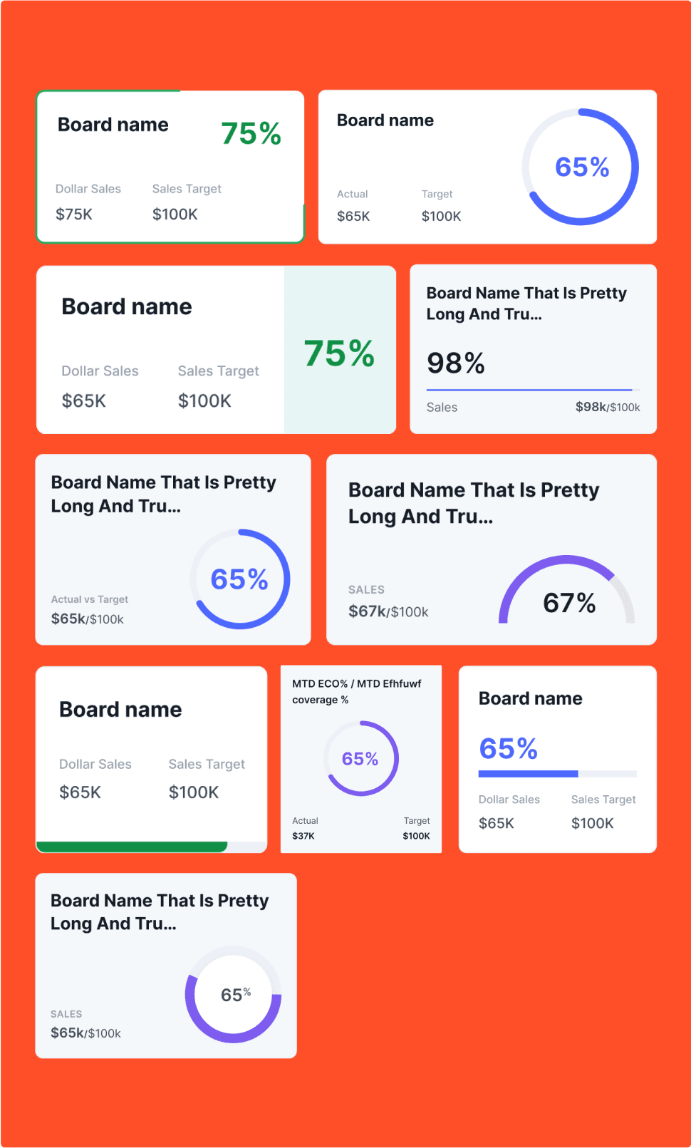
Widget explorations – Web
Below are some of the widget cards that were explored for a web layout. Keeping in mind the mobile layout and seeing how that could be translated into web.
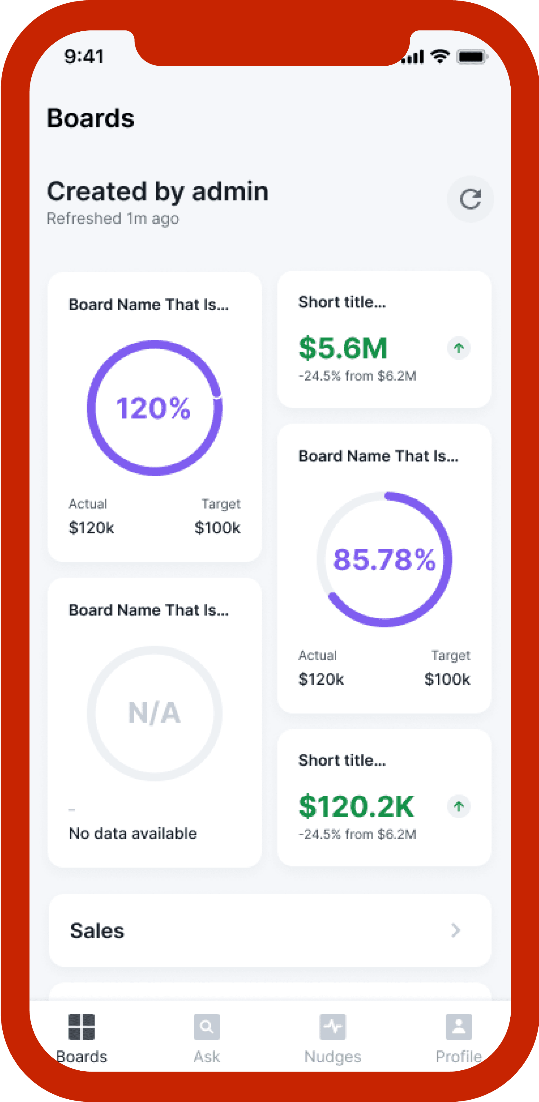
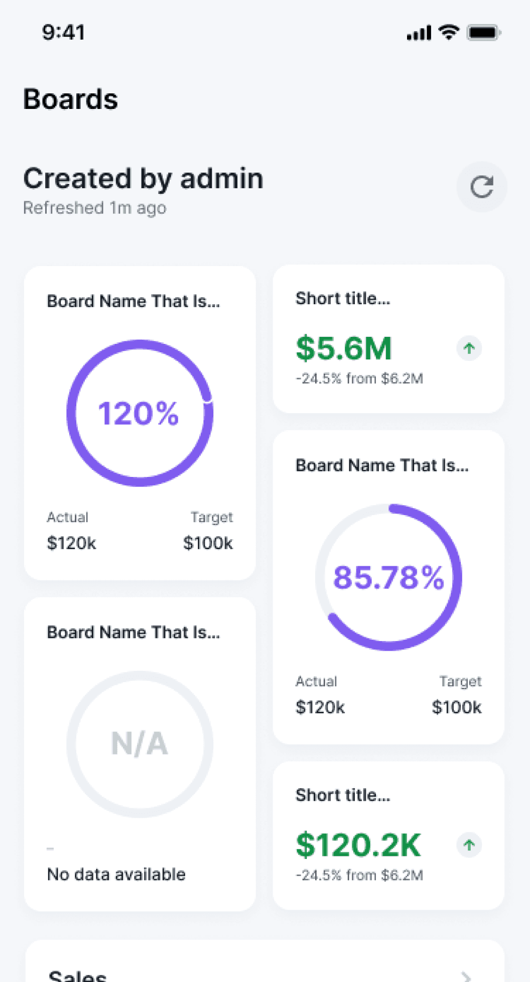
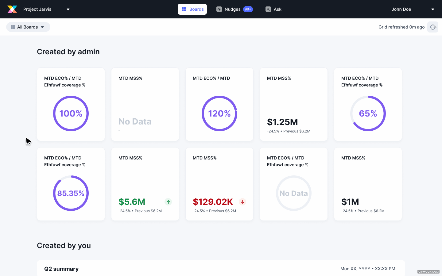
MVP Design
A cleaner dashboard with data that can be consumed easily.
While the project was to only redesign the achievement widget, I also redesigned the KPI widget for future implementation. But since the project was handed off sooner from the design team, the KPI widget was also developed and released as a part of this.
The cards transitioned to a white hue and incorporated 4px rounded edges for a contemporary, intelligent, and tidy appearance.
A slate grey backdrop provided subtle contrast against the cards.
Purple emerged as the preferred choice for the achievement widget's primary color, proving more neutral and less conflicting than the app's blue hue.
On desktops, titles truncate after two lines, while on mobile, truncation occurs after the first line. This choice considered the card size and quantity that could fit within the viewport.
Desktop cards expand and collapse to display actual and target numbers, maintaining a two-row layout in the viewport.

www.cruxintelligence.com
Over 100% Achievement
When a user has more than 100% achievement, apart from visually representing it, I also wanted to create a moment of celebration.
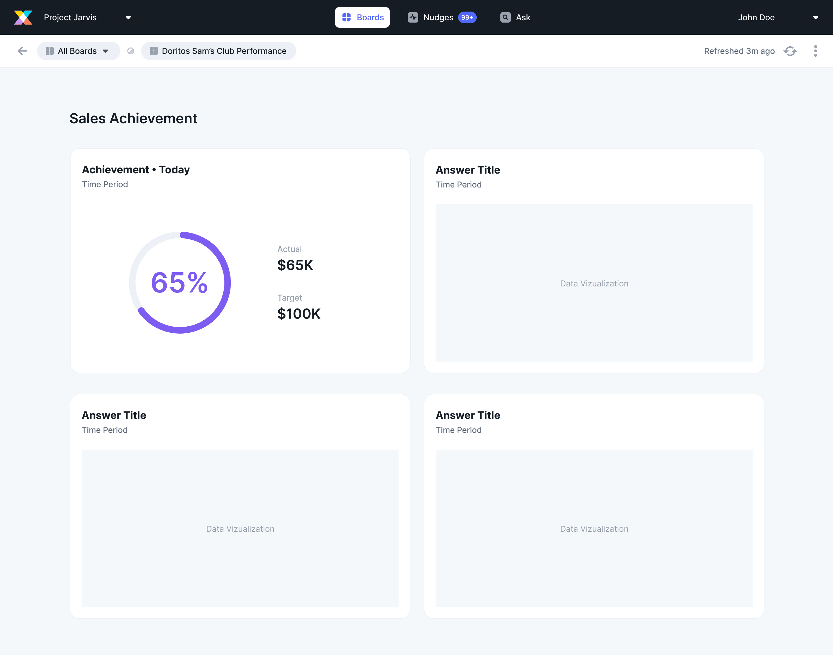
Achievement in Board Detail
Designing for the same achievement visualization in board detail view (or when the user clicks on the widget).
www.cruxintelligence.com
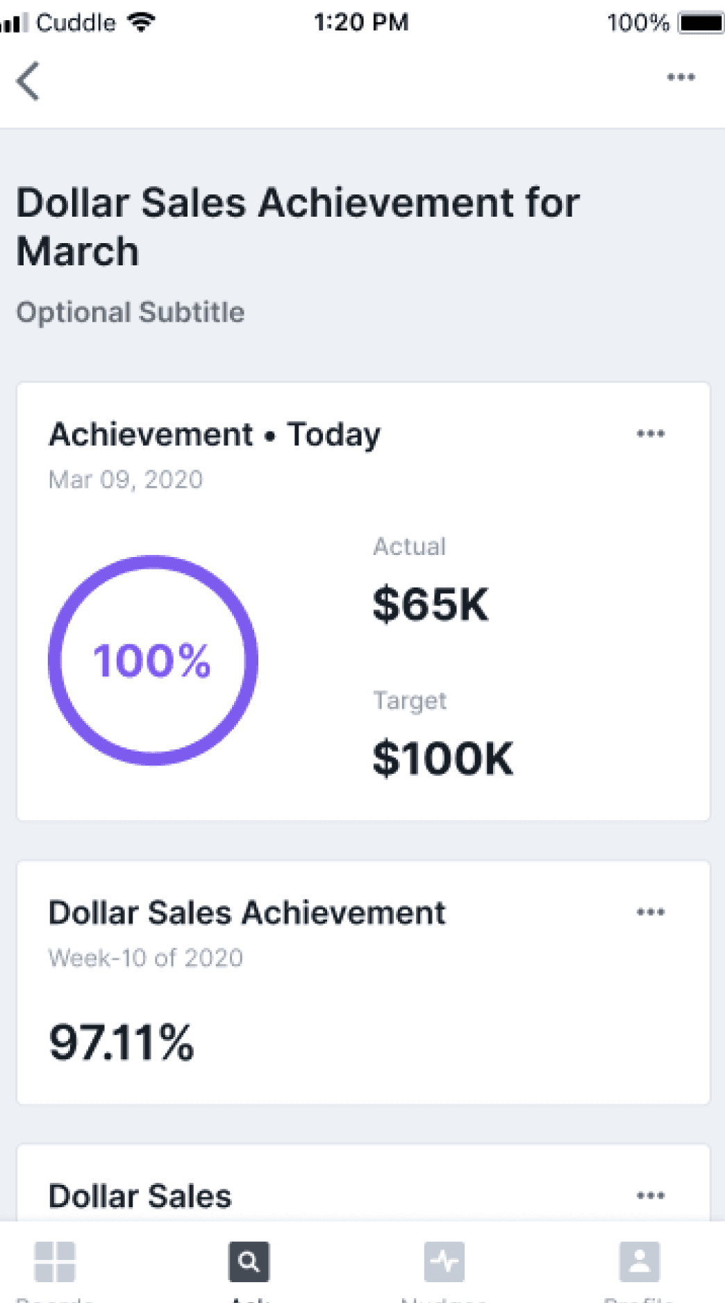
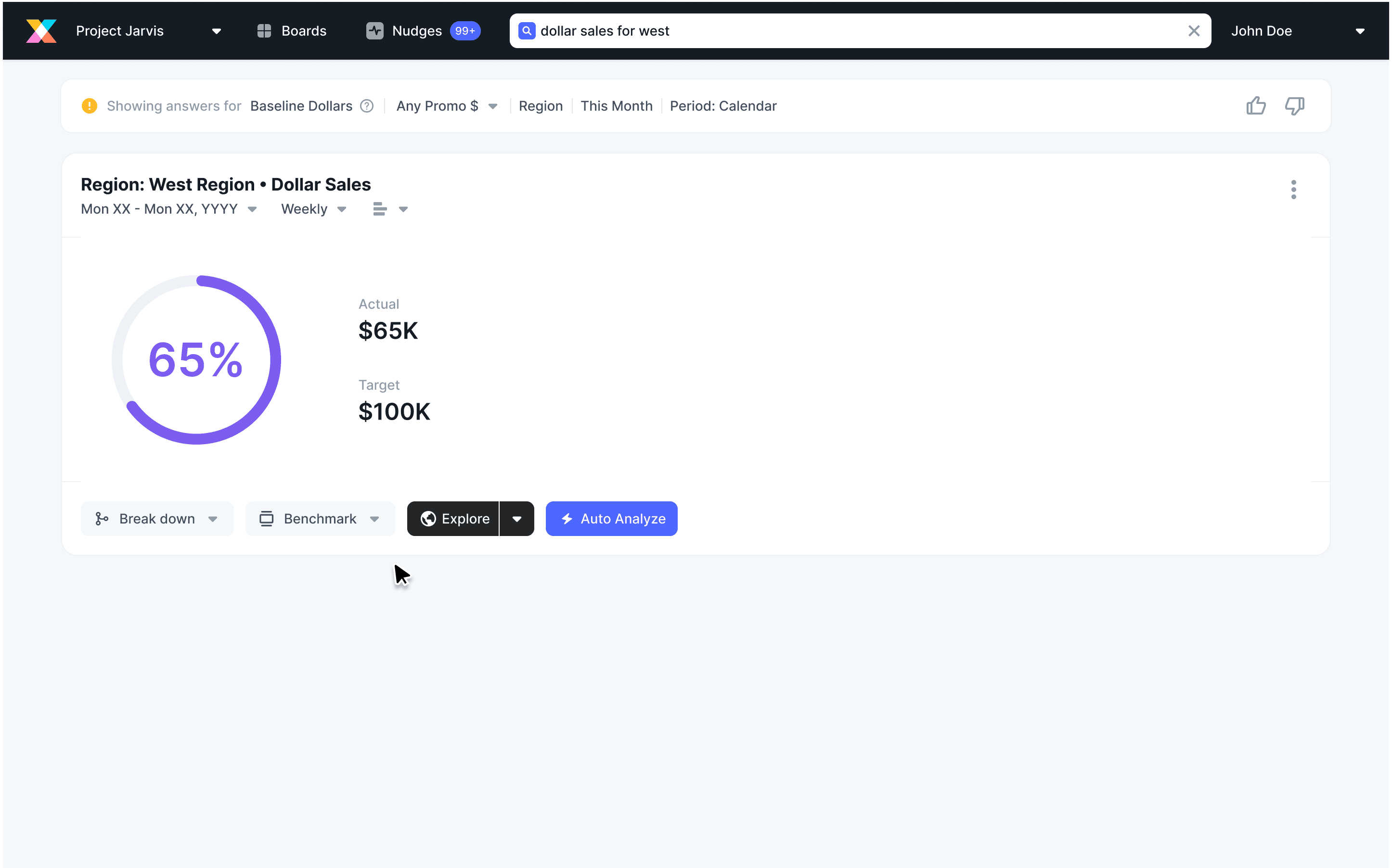
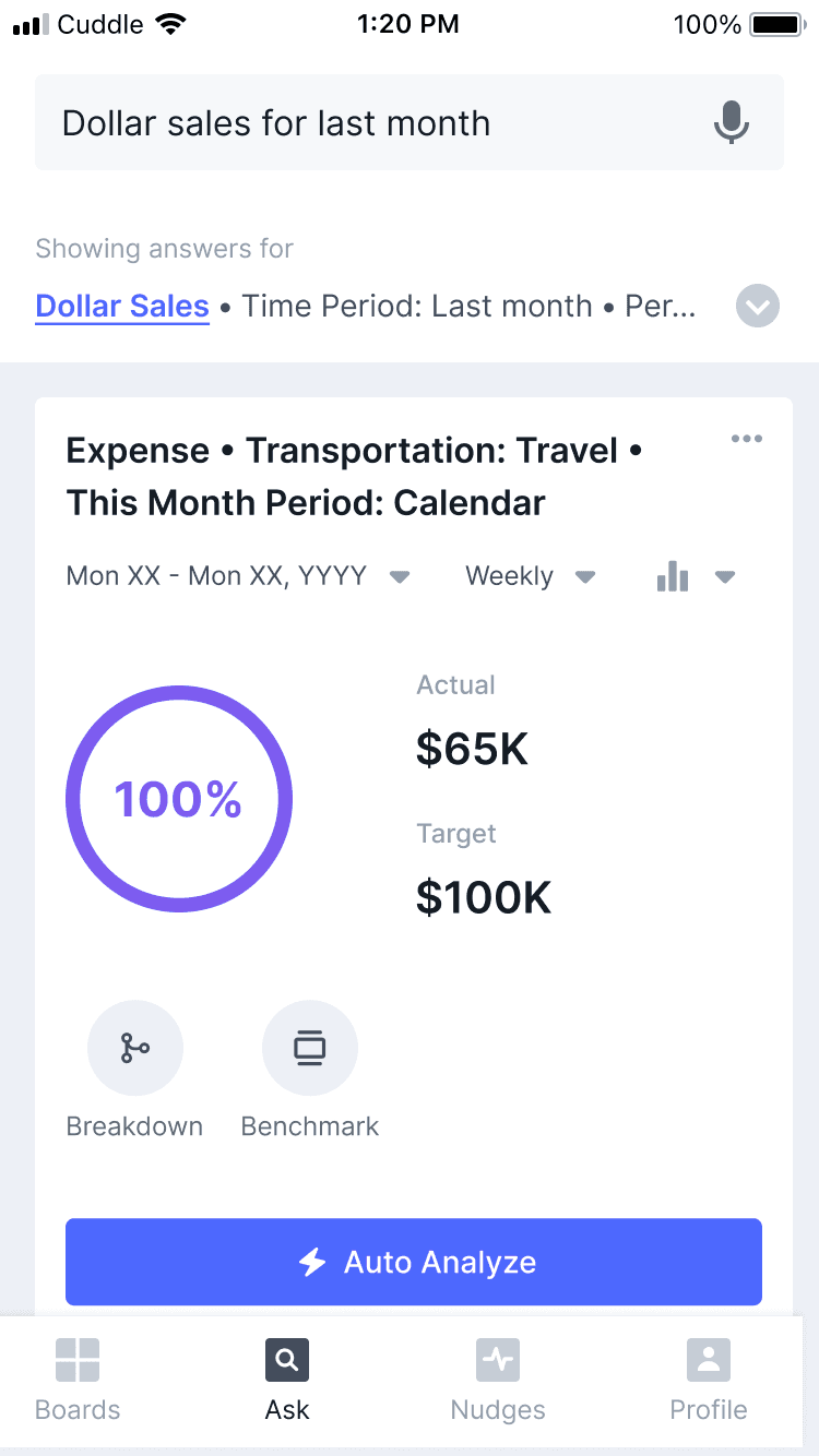
Achievement Widget in Answer Card
When the user asks (searches) a question, the answer card in case of achievement must also have the same visualization.
www.cruxintelligence.com
Metrics
Clear representation of Actual/Target and Achievement percentage that can be understood in a quick glance
Learnings
Working across teams like customer success, product management, and tech.
How you can design for the MVP and give suggestions for future implementations that might have not been mentioned in the PRD but still get attention towards why that might be important.


Introduction
Boards is that section of the app that every user lands on as soon as they open the app. Each board is curated by the admin for a particular user group and they have some key widgets that they check first thing when they start to work every day. Although Crux is known for its Ask feature, the user gets to ask only after they consume numbers for the day and want to ask follow-up questions or analyze this number in detail to create reports.
Problem
The existing board section of the app, the widget which displays the achievement numbers and the KPI could visually use a treatment for easier consumption of information. All the widgets presented numbers similarly, so there was barely any hierarchy at first glance. Some of the other requirements were:
It would be great if the user could also see the actual and target achievement numbers.
Greater than 100% achievement was not an edge case and had to be solved.
Process:
Defining the Principles
I learned that it’s great to base the foundation of any project on a set of principles that can be used as a guide and can be referred to time and again.
✏️ Efficiency
Making consumption of numbers efficient at first glance.
👁 Clear Hierarchy
To establish clear hierarchy of information visually.
🌎 Clean and Simple Natural
Data visualization can often create clutter. The goal here is to maintain
🧠 Smart
The system provides suggestions that are the most relevant and eventually often asked by the user
Widget explorations – Mobile
Below are several widget card concepts for a mobile layout. The primary aim was to investigate various methods of visually presenting achievement numbers while discovering unique layouts for the same data set.
The exploration considered the following factors:
Neutral colors were essential as sentiments were not part of the development scope.
A mobile-first approach was adopted to ensure data compatibility between mobile and desktop layouts.
The central achievement percentage needed to be conspicuous and immediately noticeable.
The visual representation of the percentage should effortlessly complement the data.
'Actual' and 'target' were the preferred titles for the respective numbers.
The design accommodated the possibility of the widget title spanning two lines.
Widget explorations – Web
Below are some of the widget cards that were explored for a web layout. Keeping in mind the mobile layout and seeing how that could be translated into web.
MVP Design
A cleaner dashboard with data that can be consumed easily.
While the project was to only redesign the achievement widget, I also redesigned the KPI widget for future implementation. But since the project was handed off sooner from the design team, the KPI widget was also developed and released as a part of this.
The cards transitioned to a white hue and incorporated 4px rounded edges for a contemporary, intelligent, and tidy appearance.
A slate grey backdrop provided subtle contrast against the cards.
Purple emerged as the preferred choice for the achievement widget's primary color, proving more neutral and less conflicting than the app's blue hue.
On desktops, titles truncate after two lines, while on mobile, truncation occurs after the first line. This choice considered the card size and quantity that could fit within the viewport.
Desktop cards expand and collapse to display actual and target numbers, maintaining a two-row layout in the viewport.
www.cruxintelligence.com
Over 100% Achievement
When a user has more than 100% achievement, apart from visually representing it, I also wanted to create a moment of celebration.
Achievement in Board Detail
Designing for the same achievement visualization in board detail view (or when the user clicks on the widget).
www.cruxintelligence.com
Achievement Widget in Answer Card
When the user asks (searches) a question, the answer card in case of achievement must also have the same visualization.
www.cruxintelligence.com
Metrics
Clear representation of Actual/Target and Achievement percentage that can be understood in a quick glance
Learnings
Working across teams like customer success, product management, and tech.
How you can design for the MVP and give suggestions for future implementations that might have not been mentioned in the PRD but still get attention towards why that might be important.